25 Mar 2014
One frequent need in BI is something called a role playing dimension (see http://en.wikipedia.org/wiki/Dimension_(data_warehouse)#Role-playing_dimension for a definition). The classic example of this is a Date dimension that is related to a Sales fact table and used either as date of order and date of shipping. One obvious solution would be to add the date table twice to your data model, but that would not only result in a larger data model but also in more work: if you add a calculated column to the date table (such as to use the sort by column trick I explained earlier) you would have to do that on every single date dimension in your model.
Luckily Power Pivot has a handy function called USERELATIONSHIP (explained here: http://technet.microsoft.com/en-us/library/hh230952.aspx)). In this post I will walk you through an example.
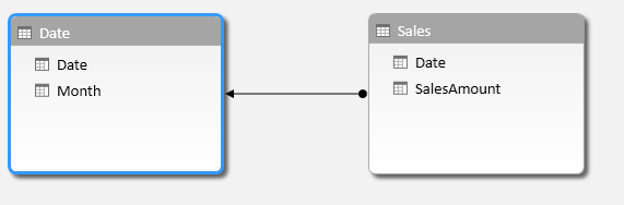
Let’s say you have this simple data model again:
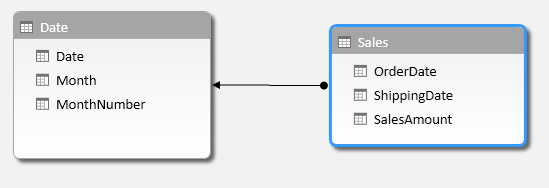
This is a Date dimension related to a Sales fact, just like in my last Power BI pro tip.
The relationship between the two tables is on the Order Date:
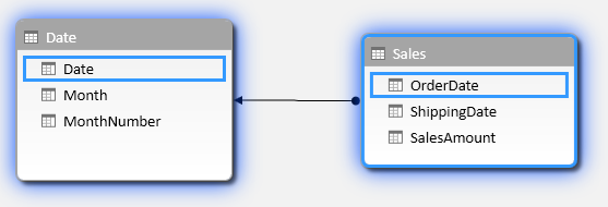
Now, notice that the Sales table also has a column for Shipping Date. Let’s create a relationship based on that column to the Date table. You can either drag and drop the columns or right click on ShippingDate and choose ‘Create Relationship’.
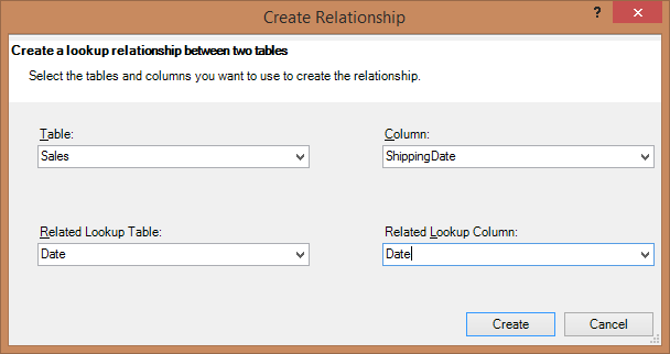
Here are the settings I made:
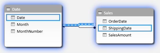
When you hit create you end up with two relationships between Sales and Date as expected, but one is a dotted line, which means it is inactive. This will be the relationship on shipping date.
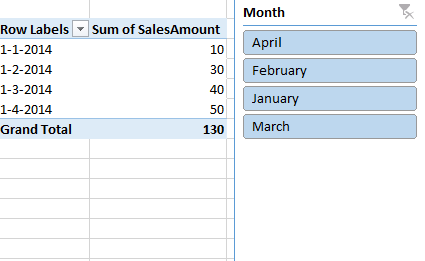
No, create a report on this where you display SalesAmount per Month, like this:
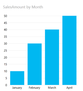
The question now is which Date we are looking at. Is it Order Date or Shipping Date? It turns out that the active relationships is used, which is the one on order date.
Now, I would like to add a graph that shows the sales amount by shipping date. For this we will need to add a measure to our data model. Go to Power Pivot and add a measure to your Sales table by selecting a field in the bottom part of your Power Pivot window:
In the formula bar enter the following formula: SalesAmountByShippingDate:=CALCULATE(SUM(Sales[SalesAmount]);USERELATIONSHIP(Sales[ShippingDate];’Date’[Date]))
(Note that you might need to use comma’s instead of semi colons to separate parameters).
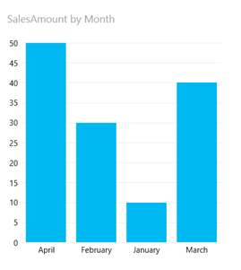
Now add another graph to your Power View report where you use this measure and plot that against months:
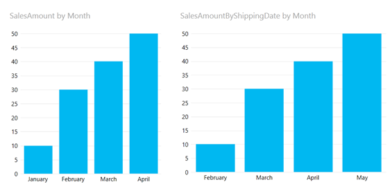
Now the graph on the right shows the sales amount by month using the shipping date as the relationship, while the graph on the left still shows the sales amount by month using the active relationship, which is order date.
And that’s how you use USERELATIONSHIP to show data when using a role playing dimension in Power BI.
That’s it for this Power BI Pro Tip. Until next time!
18 Mar 2014
Here is an easy solution to a very common problem when making reports: how do I change the sort of some items from alphabetically to something else?
The most apparent sample of this is Months. Let’s say you have to following (very simple) data model in Power Pivot:
That is, you have a Sales table that reports SalesAmount on a Date and related to that Sales table is a Date table (dimension) which stores dates and month name.
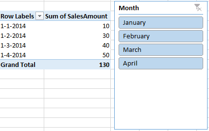
Now you create a PivotTable and provide a slicer to filter:
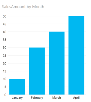
Or you create a Power View report:
What’s wrong here? Your users probably want the months ordered correctly not alphabetically by month name as they are now in both the slicer and the Power View graph.
Of course you can give the months a numeric prefix like ‘01 – January’, ‘02 – February’, etc. This may work perfectly fine for you but I think this approach is impacting the user interface to much.
There is, naturally, a better way. And it is very easy to implement. All you need is two modifications to the date table.
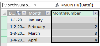
- In Power Pivot go to the date table and add a calculated column with the following formula: =Month([Date]) :
- Then click on the column that contains the Monthname (my second column) and choose Sort By Column:
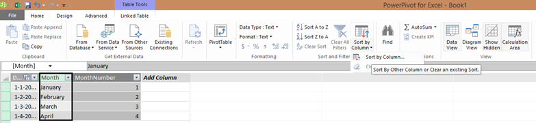
- In the dialog choose MonthNumber as your column to sort by and click OK:
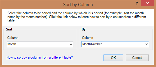
- Done.
Now go back to Excel and look at the slicer and your Power View report. Both of them now sort correctly thanks to the power of Sort by Column. This of course is applicable to anything, not just months or dates.
That’s it for this Power BI Pro Tip. Until next time!
26 Feb 2014
The word is out! On January 31, we published a post on the official Office blog where we layed out the future of InfoPath. I have been thinking about this for a while and am glad that the decision is there: “there will not be another version of the InfoPath desktop client or InfoPath Forms Services” (source: the Office blog post, see above).
I feel the functionalitity that InfoPath provided will find its way into other parts of the Office suite and SharePoint. Take Access for example: Access is much less a database program than it was before. If you now start a new database, the first question you get is to specify in which SQL Server the database should be created. The forms Access creates can now be published to SharePoint to facilitate easy data entry and editing into databases. InfoPath provided other features and challenges, and I am curious as to where the features will go. I am certain we will get rid of some of the challenges InfoPath has (XML forms anyone?).
So, bottom line: yes, “Partir cest mourir un peu”. It hurts to get rid of a product, but I think it is for the best; we get a better, clearer proposition and a rationalized product line up. All in all, less confusion, same or better functionality. What do you think?
19 Feb 2014
Today we (re)launched SkyDrive OneDrive, our solution for storing, sharing and editing documents in the cloud. OneDrive is cross platform (Android, iOS, Windows Phone, Windows) and syncs files automatically. It even enables you to edit Office files right there in the browser. Even better: it’s free!
Check it out: http://blog.onedrive.com/onedrive-for-everything-your-life/
11 Feb 2014
Last week Satya Nadella was announced as the new CEO of Microsoft (see http://www.microsoft.com/ceo). This was met with a lot of reaction in the world and also on the social networks. I decided to analyze the tweets on Twitter using my favourite tool Excel and a special Twitter Analysis add-in that we have made available through http://husting.com/twitter-analytics-for-excel/ . I opened the twitter analytics sheet and did a new query. Here’s what I searched on:
#ceo #nadella #microsoft #satyanadelle @satyanadella
There is really a lot of info that you can get from the Excel sheet. I cannot cover all of it, but I’ll share some screenshots:
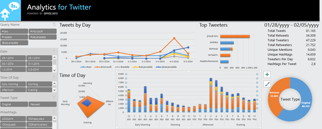
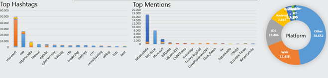
What I found interesting is the hashtags and mentions. Of course #microsoft, #ceo and #satyanadella are the top three hashtags but #Manual is on fourth place. #cybersecurity and #hacking take sixth and seventh place respectively. Looking at the mentions I noticed @satyanadella, @billgates and @Microsoft, but also @bill_nizzle. Not sure what he is doing there J
In the top screenshot some slicers are shown that enable you to filter the data at will to slice and dice to more insight.
One thing I especially like is the tone map that displays whether a tweet was positive or negative. It also has a map so you can see where the tweet came from and allows you to play back the number of tweets over time:
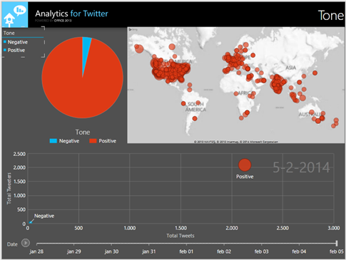
Only a small amount of the tweets were negative and when I selected negative tweets only I saw the following:
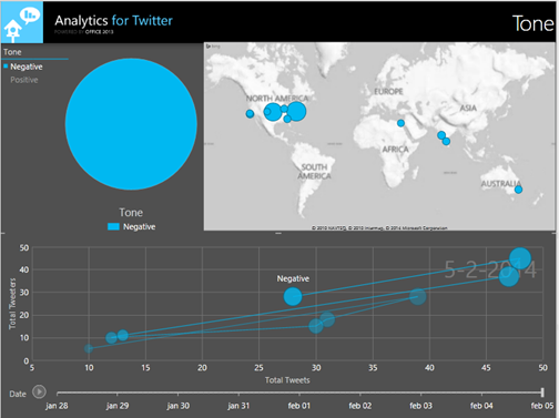
It seems like in Europe we have not been tweeting negatively on this subject (at least in the timeframe I recorded). The US is most negative and also there were some negative reactions from Nadella’s home country India, from Australia and Egypt.
This is a very easy way to do any kind of on the spot Twitter analysis using Excel. The Excel sheet used is freely available via the link above. Enjoy!
 Dutch Data Dude