04 Feb 2014
Those of you who have tried Power BI may have noticed the Featured Questions tiles:

(Those of you who have not yet tried Power BI: go to powerbi.com and build you own demo environments in minutes for free!)
The featured questions function as a sort of shortcut / favorite to an answer in Q&A. What is cool is that you can actually add your own.
To do this start Q&A and come up with the question you would like to feature. I used “medal count by country in europe for swimming vs athletics”.
Now, copy that question (or remember it) and click on the fly-out on the right and then choose “featured questions”. Next click on “add featured question”.
In the next window type or paste your question and wait for Q&A to validate it.
Be sure to enable ‘show on the Power BI site home page’ if you want your question to show up on the home page and continue setting up your tile. I used these settings (I used an image from Wikipedia to function as background. Not the prettiest but it works):
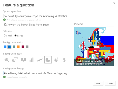
Next click ‘save’. Next go back to the Power BI home page and there it is:
Pretty cool huh?
28 Jan 2014
In an earlier post I used Power BI (specifically Power Query, Power View and Power Pivot) to get insight into my music collection. In this post I have a conversation with my music collection using Power BI Q&A.
Q&A enables you to “talk” to your datasets and ask questions in natural language. Q&A gets the data, proposes a visualization and displays it. You can then change the question, get immediate feedback. This invites the user to do data exploration.
What I did to make this work is this: I uploaded the Excel sheet to SharePoint and enabled it for Power BI. Then I enabled the same sheet for Q&A. Next step was to use Q&A and ask questions.
The question I started with was: “number of albums by release date”. Q&A responds like this:
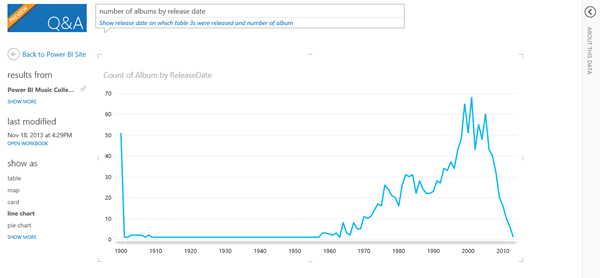
As you can see, it selected my Excel sheet and chose a line graph to display the number of albums by year. What is interesting is the spike to the left. It turns out this is a data quality issue: a lot of dates have been reported as being 31/12/1899 when there was no date in the tags in the first place.
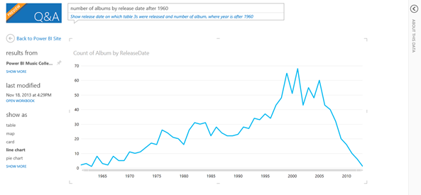
Let’s say I would like to focus more on recent data, such as albums since 1960. I refined my question to “number of albums by release date after 1960”, which gives me this result:
Then I decided to look at one decade: “number of albums per artist where decade is 1980 – 1989”. This is the result I got:
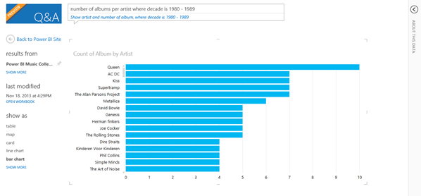
As you can see in this decade Queen is on the top. Let’s dive a bit deeper into in which decades Queen released albums that I have in my collection: “number of albums by decade where artist is Queen”. This is the result:
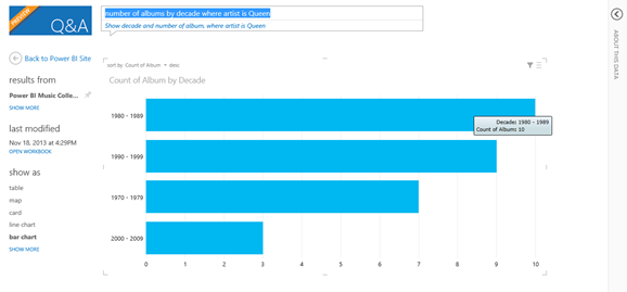
As you can see I have got quite a few Queen albums spread over multiple decades. Now let’s see if Queen is indeed as popular in my collection as it might look. I decided not to look at albums but at number of tracks. I refined my question to: “top artist by number of tracks”. This is the result.
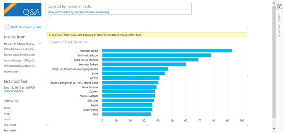
Interestingly Queen is only in 10th place here (even after the choir which my mom is part of J). Based on the number of tracks Herman Brood is the most popular artist in my collection.
This got my wondering about the actual duration of the music (track length). Finally, I changed the question to: “top artist by total length”. This gave me the following result:
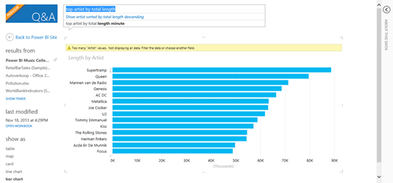
When looking at the total track length of all songs Queen is back at place two and my all-time favorite band is on top (Supertramp).
Hope you enjoyed the tour of my music collection using Q&A. Looking forward to feedback and your examples!
14 Jan 2014
Personally I do not like the use of 3D in data visualization. Every time I see a 3D column chart I can’t help thinking that who made it must have something to hide. The data might not be interesting enough so the graph needs to spice things up.
In my opinion 3D is pretty much useless and more a distraction than a help. There is one exception to this and that is the third dimension in a XYZ plot like the one below:
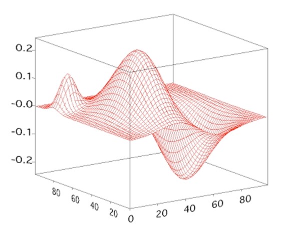
However the general usefulness of these plots (however sexy) is virtually none.
So, bottom line: I see no value in 3D in data visualization.
Or, better, I saw no value in 3D in data visualization. Because now we have 3D printing! Suddenly there is value in 3D with BI. How cool would it be to actually be able to print your 3D graph and have an actual model of the graph? If you make it from degradable substances you could even re-use the substance when you refresh your data and reprint your graph.
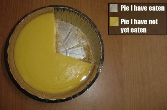
Think about it for a second! Let’s for once assume that people will still be using pie charts (despite my rant against them). I see a business model here that finally makes the pie chart live up to its name and have some value (fill a stomach or two).
“Pie your data: your bring us data, we bring you pie”. Or “eatable insight”. What I mean is this: a company that delivers delicious pies that show your data. Let’s imagine you plot your sales amount per region as a pie chart.
You order the pie and have it delivered to your sales meeting. Each will get the slice for their region.
How’s that for direct feedback? “Feeling stuffed? That’s because you have done so well!”. “Hungry? Make sure you sell more and you will earn yourself a bigger slice of the pie!”.
07 Jan 2014
Pie charts. By far the most popular chart type among business users. Also the most unusable chart type. Every time a business users asks me for a pie chart a kitten a bit of me dies. In this post I explain why.
Let’s start with the basics: what is a pie chart? A pie chart is a circular graph that is divided in parts (slices) by lines coming from the center. It is used for part-of-a-whole analysis, such as to compare product sales per product category. Here it is important to be able to spot small differences in size between slices. When multiple slices need to be shown it is often displayed in 3D (yuck!) because otherwise the smaller slices would not be visible.
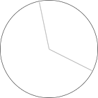
To explain what is wrong with pie charts, let’s imagine a clock. A normal clock is a circle with two hands to show time, such as the one below:
Look at the clock above: it quite clearly shows 5 o’clock right? It also divides the total circle into two segments, one obviously larger than the other. All is fine here.
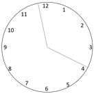
Let’s look at the same clock again:
Now the clock seems to show some minutes just before 4 o’clock, maybe 3:55? Here it already gets harder. That’s why we added numbers along the circles perimeter to help you read time, like this:
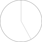
Ok, let’s now imagine a clock with three hands (often used to show seconds):

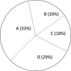
See how the clock divides the circle into three sections, all of almost equal size. Here, let me label them for you:
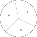
Care to tell me which one is bigger? A, B or C? Which one comes in second? Which slice is the smallest? Pretty hard right?
Let’s add another hand and bring the number of slices to four:
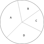
Now, suppose you want to understand which one is the biggest and which one is the smallest. The biggest is obviously either A or D, but which one? The smallest is clearly B or C, but again, which one? You can’t tell.
However, for a user, it is vital to know if Product A sold more than Product D and by how much. Also, if you want to understand which product is the worst-performer and why how much we need to be able to judge if B or C is the smallest and by how much.
Of course, we can come up with a work around and include data labels to help the user understand:
Now we can see that A is the best performing product while C is the worst performer. However, we had to add labels to be able to see it.
The point here is that as a species we humans are practically incapable to determining if a slice of a circle is bigger than the other. If only given a short glance some people will not see a 10% difference. If given more time most people with see differences as small as 5%. What if the difference is 1%? What is that 1% meant profit or loss for your entire company?
The examples above are very simple: I hardly come across pie charts with only four slices. Imagine what happens when there are more! What happens if one slice is really big (let’s say 90%) and there are ten others dividing the remaining 10%?
There is something seriously wrong with pie charts. Data visualizations should be built to tell the story immediately and accurately. The user should not have to give it a minute or even 20 seconds to study the graph to understand what is going on. The user should be able to spot even the smallest of differences while still seeing the big picture. Pie charts may look pretty but are impossible to read quickly and accurately. (This holds true for most pie charts. It gets better if only two slices are shown, much like a clock).
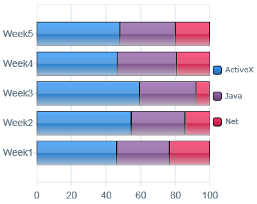
For part-of-a-whole I prefer to use bar charts and depending on the data I go for a 100% stacked bar chart, like the ones below:
So, please get rid of the dreaded pie charts. Tell users that they should not be looking at pies but eating them. Make this world a better place and eradicate the pie chart once and for all!
 Dutch Data Dude