 Dutch Data Dude
Analyzing Amsterdam Crime Rates with Power BI
22 Apr 2014Here is another example of what can be done with Power BI. This time I attempted to analyze crime rates in Amsterdam.
I retrieved burglary and burglary attempts figures from the Dutch Police website: http://www.politie.nl/misdaad-in-kaart/lijst?geoquery=amsterdam&categorie=1&categorie=2&pageSize=500&page=1
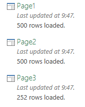
There are three pages here, so I use Power Query to get all three pages into Excel and then appended them together in one big table. I did this using three ‘from web’ commands in Power Query, so I got the following queries:
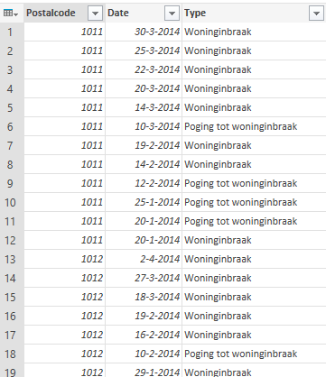
Next step was to append the three tables together. I started with the ‘append’ command in Power Query which allowed me to append Page1 and Page 2 together. A quick edit of the code gave me the result I was looking for:
let
 Source = Table.Combine({Page1,Page2}),
 Source2 = Table.Combine({Source,Page3})
in Source2
And the resulting table:
Next, I loaded the table to PowerPivot, added a quick sum and then opened Power Map by going to InsertàMap in Excel.
In Power Map I created three layers, one using shapes, another one using a heat map and a third using a column graph. Then I created a tour using these layers. The resulting video is below.
As you can see, it is really easy to visualize geographical data using Power BI in Excel! Pretty cool huh?